3 Essential elements of a successful website
Successful websites are rare, so we garther all the facts , here are the 3 Essential Elements of a Successful Website.
If you want to be successful in business you need an online presence, that’s a given. The question is once you choose the right website builder for you, where do you go from there? And how do you make your website look unique but professional?
Although great websites come in every shape, size, and color, there are some rules you should follow to give your visitor the best possible experience with your brand identity.
#1 Awesome visuals
Website visuals are composed of many things. It includes the images you use, the way you structure content on your pages, the way you present your videos, and the way you present your website interface.
Add original creative and high-quality images
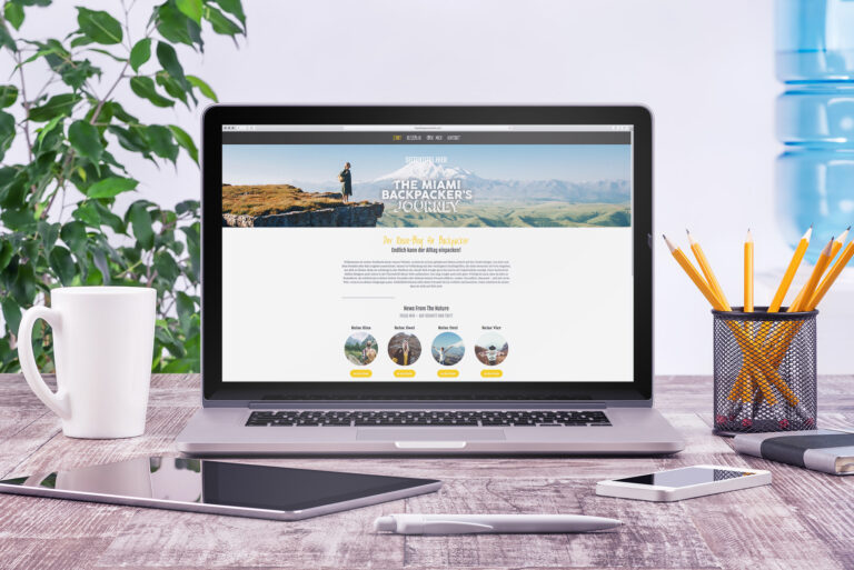
Websites are visual creations. No matter how well you can explain your business, it’s the look of your website that will convey much of the information. That’s why it pays to put the time into finding the right high-quality images.
A large, full-width hero image can work beautifully to show off you and your product or services in the best light and make that first impression count.
Images can also work to break up the text on your website and keep your visitor’s attention, especially if your site is text-heavy. The general rule is to have at least one image on every page of your website. Any images should be related to your product, blog, or service and should serve to enhance your overall message rather than distract from it.
If you fancy yourself as a DIYer there are some nice photography tricks out there that make it easy to get creative and take your photos for your website. Alternatively, if you don’t have the time, there is a great range of high-quality stock photos that you can use for free.
Create a favicon (the logo that appears in the browser tab)
If you have a business, a great logo will make your brand stand out and add legitimacy. If you want a logo but are no designer yourself, there are some first-rate options out there without an eye-watering price tag attached.
We like 99designs, where you can sponsor a logo competition and a variety of different designers will post entries so you can just pick the logo that is right for you. Once you have a logo, you can use it everywhere—on your website, product packaging, social media accounts, and email signature.
Use white space
Too much information or clutter can be a strain on the eye. Though it may seem counterintuitive to leave space on your web pages, that “white space” makes it more visually pleasing and easier for people to focus on important information.
#2 Simplicity of use
According to Google’s research, users prefer simple and familiar designs —and they make a snap judgment about a website in less than the blink of an eye. Fortunately, most website builders offer templates and suggested layouts, so you already have an outline of where to start. Then you can just prioritize what is essential for your website.
Easy navigation
A clear and easy navigation bar should be short with a maximum of seven items. The more time people spend searching for what they want, the more likely they are to bounce. So prioritize your items to fit into one line of navigation. This makes for a more visually appealing website and is easier to scan through. If you need to add more items you can always create sub-pages.
Clear content
All the graphics and web design in the world won’t accomplish anything without some quality text that gives value to your readers. Quality text for your business doesn’t mean your website should be the next “War and Peace” novel, but take the time to think about what you want to say, then condense it in a bitesize paragraph or sentence. Asking a friend to proofread your work will make sure there are no hidden typos that can make your website seem unprofessional.
Scannable text
We live in an age where we can track news on our smartphones in real-time. People want to find the information they need and fast. Most viewers will likely skim-read your website, so try not to leave big blocks of intimidating text that people will just pass over. Break up your text into small pieces, use bullet points, headings, and images to add more white space.
Clear call to action
Of course, you want people to enjoy your website, but if you have an online shop or business, the chances are your main goal is to encourage visitors to buy your product or service. Once your visitors is interested in what you’re offering, a good call to action can help convert them into a customer.
Use a link or a button with an active tone to convey an engaging and snappy action to give the visitor a clear direction. For example “Curious? Read on” or “Let’s go!” The trick is to create a sense of urgency or anticipation and get people excited about your product in a positive way.
One call to action on each page is a good rule of thumb and will avoid your visitors searching around your site to get started.
Visible social media buttons
Whether you love it or hate it, social media is here to stay. Everyone is getting on the bandwagon; from Barack Obama being the first #POTUS on social media to more established brands realizing they have to change with the times.
Social media buttons should have pride of place on your homepage so visitors can easily “like” or “share” your post. It is an invaluable tool that previous generations didn’t have, to build up a fanbase and maximize exposure on a global scale.
#3 Solid infrastructure
Building a good-looking and easy-to-use website is only the element that people can see, but some of the most important aspects of a great website are happening behind the scenes and under the hood. These infrastructure elements can make or break even the prettiest website. Things like your technical SEO, your domain name, and the responsiveness of your website architecture.
If you are commissioning a website you should make sure these aspects are addressed in the design proposal. If you are building a website for others you should include these in your proposal (you can use this website design proposal template to save time).
Lay down solid foundations for SEO
Think that only humans will read your text? Think again. Google spiders are also crawling your website. There is a whole industry around SEO and keywords to get the best possible competitive edge.
Try to use words that people would type into Google to search for your website. For example, if you’re selling spiralizers on your website, you might want to drop in a few associated keywords or terms like “healthy lunches” or “healthy diet” in your website copy. If you are ready to go further but don’t have the luxury of an SEO expert on your team, try using Google’s Keyword Planner to find more search terms.
With most website builders, there are SEO settings that you can fill in on each page with a title and description. That will help Google know exactly what your page is about, and make your pages look better in search engine results.
Use a custom domain
A domain (website address) will show that you are professional and committed to your business or blog. Try to keep your domain name simple and catchy, so it sticks in people’s minds. If they love the service and remember your URL, the chances are they will pass it on to a friend.
If you can grab a “.com” domain for your business— great! Otherwise, there are also some good alternatives that you can associate with your brand, for example, “.org”, “.co.uk” or something like “.consulting” which is related to your business.
Build responsive page templates
Every day more people are checking websites on their mobile. This means your site has to look great on a desktop, tablet, and smartphone.
If you are building your website, make sure you have a responsive template active to help out mobile visitors. This may seem obvious to a more tech-savvy generation, but time and again I have checked out a reputable company’s website on my iPhone to find that text is all over the place. As a bonus, Google rewards mobile-friendly websites in its search results, so having a responsive template will help your search engine ranking.
Conclusion
Simplicity is key when building a successful website. Be creative with your content and imagery, but stick to a basic layout that visitors can navigate and understand.
Most importantly, remember that “Rome wasn’t built in a day” and neither will your website. Think of it as a work in progress that you can improve gradually. Even if you don’t have everything checked off your list, you can get started with the basics, and then finesse the details later. Your website should be a fun experience so enjoy the ride!
Article provided by Jimdo, a simple way to build your business website, with no coding or special skills required.