Email Signature Colors: 6 Rules for a Professional Look
Learn email signature colors best practices. How to pick, combine, and enforce your brand palette across every signature company-wide

Short answer
How should you use colors in an email signature?
Email signature colors should come from your brand palette and stay limited to 2–3 choices. Apply your primary color to your name or key contact details, use a secondary accent for CTAs and dividers, and always maintain enough contrast for readable text.
Brand Risk
Unmanaged signature colors are quietly damaging your brand
Signature colors that go unmanaged affect how every email your team sends is perceived. When employees each pick their own colors, the result is fragmented and inconsistent with everything else your brand touches.
For marketing and brand managers, this compounds over time. Rebrands roll out and new templates go live, but signatures stay the same. Months later, customers are still receiving emails with last year’s color scheme, or no scheme at all.
Color Guide
What are the rules for choosing the right email signature colors?
Email signature colors follow the same logic as any brand touchpoint. These 6 rules keep them consistent and professional.

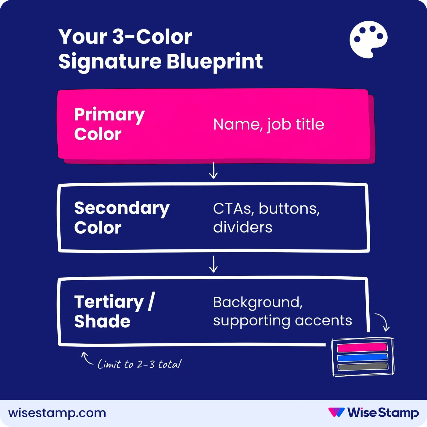
1. Match your brand palette. Pull colors directly from your logo and website. Most brands use 3 colors: primary, secondary, and tertiary. Use the primary for the most important signature elements.
When we spoke with Amanda Gratz, Design Operations Manager at Bizzabo, about what consistent branding in email meant for her team, she shared: “Our nice new yellow Bizzabo logo is now very visible in every email we send, which considerably increases our brand recognition.”

2. Maintain contrast for readable text. If your primary brand color is too bright for body text, use a darker supporting shade. Tools like Adobe Color and Coolors help you find palette-compliant combinations that are also legible.

3. Limit total colors to 2–3. One primary for key details, one secondary for accents, design elements, and buttons. More than 3 colors fragment attention and signal a lack of design discipline.

4. Use color to create visual hierarchy. Apply your primary color to the field you want recipients to notice first. Whether that’s your name, your title, or your phone number depends on what your brand needs to communicate.

5. Use design elements to make your brand color land. Vertical lines, horizontal dividers, and background blocks amplify brand colors without adding clutter. The challenge is keeping those colors consistent at scale.
WiseStamp’s Studio editor lets you apply exact hex codes to every signature element and publish those standards to every employee’s signature from a single template. One update, consistent colors across the org.
6. Align CTA colors with your palette. Campaign banners and CTA buttons should use your secondary brand color, not your primary. If your primary already marks your name or contact info, a secondary-colored CTA naturally draws the eye next. This creates a readable visual flow.

Takeaway
What are the best practices for email signature colors?
Email signature colors work best when they stay tied to your brand palette, limited to 2–3 choices, and applied with intentional hierarchy.
Primary colors mark the most important elements. Secondary colors guide recipients toward action. And consistent enforcement across your team is what separates a brand touchpoint from a branding liability.