Brand identity deconstructed: How to build a powerful corporate identity (With Examples)
How to build a powerful corporate identity? Read on and discover the Ins And Outs of branding and how to establish Brand Identity!
If you removed your logo and company name from your corporate website, would it still be immediately identifiable as belonging to your brand? Does every aspect of your audience-facing interactions express your brand values and identity?
Brand identity and corporate identities can be strong, clear, and memorable – or weak, confused, and forgettable. But compelling brand identities do not happen by accident. They are the result of an intentional process that takes into account all the touchpoints through which the world perceives your brand, and then consciously shapes that perception.
The comprehensive and practical guide will show you how you can accomplish this when designing a brand identity – with illustrations from LEGO, Chobani, Intel, Old Spice, and many more.
Let’s get started.
What is brand identity?
Brand identity refers to the unique and distinctive set of characteristics, values, and elements that define and differentiate a brand in the eyes of its target audience. It is the visual, verbal, and experiential representation of a brand that conveys its personality, values, and purpose.
A brand with strong, consistent CI (corporate identity) branding can put out a new product or piece of marketing collateral and people will react, “Wow – that image is just so ‘ABC brand’!” or “That new product says ‘XYZ brand’ all over it!”
The elements that make up the brand identity include:
Brand name
The brand name is the name by which a brand is recognized and referred to. The name “Amazon,” for example, is derived from the world’s largest river, representing the brand’s ambition to be a vast and diverse marketplace offering a wide range of products. Amazon’s brand name supports its identity by conveying a sense of abundance, convenience, and expansive selection.
Logo
The brand logo is a symbol or graphic mark that visually represents the brand. FedEx’s logo, for example, cleverly incorporates an arrow in the white space between the “E” and “X,” symbolizing speed, precision, and efficient delivery services.
This logo reinforces the brand’s corporate identity as a reliable logistics company.
Color palette
A brand color palette is a carefully selected set of colors that are consistently used across all brand communications.
As an example, whose color palette is this?

Instagram, of course!
Instagram’s color palette is vibrant and distinctive, reflecting the brand’s youthful and playful identity and evoking a sense of creativity, joy, and self-expression. Their new, dynamic color gradient adds energy to the Instagram platform experience.
Typography
Brand typography are the specific fonts and typography styles used for the brand’s written content. Nike’s “Nike Futura” custom typeface, for example, is bold, and dynamic and conveys a sense of power, energy, and forward momentum.
It’s used in their logo:
And on their website:
Nike’s typography visually supports its brand identity of athleticism and motion.
Visual style
The brand’s visual style is the overall aesthetic and visual elements, such as imagery, graphics and design principles, that reflect the brand’s personality. Patagonia’s visual style, for example, features scenic landscapes, active lifestyles, and a focus on nature.

Patagonia’s use of earthy tones, natural textures, and rugged imagery reflects its dedication to environmental sustainability and outdoor exploration.
Tone of voice
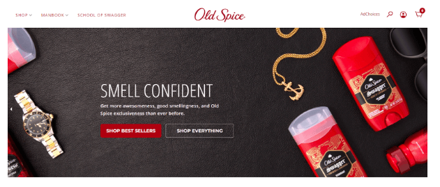
The brand’s tone of voice is the style, language, and manner in which the brand communicates its messages to the audience, reflecting its values and brand personality. Old Spice’s tone of voice, for example, is confident, humorous and over-the-top, with deodorant called “Swagger,” informational content found in the “Manbook,” and marketing campaigns known for their exaggerated masculinity and comedic storytelling.
Brand messaging
The messaging is the core messages, slogans, taglines, and key statements that communicate the brand’s unique value proposition and resonate with its target audience. Coca-Cola’s brand messaging, for example, centers around happiness, togetherness, and refreshing experiences.
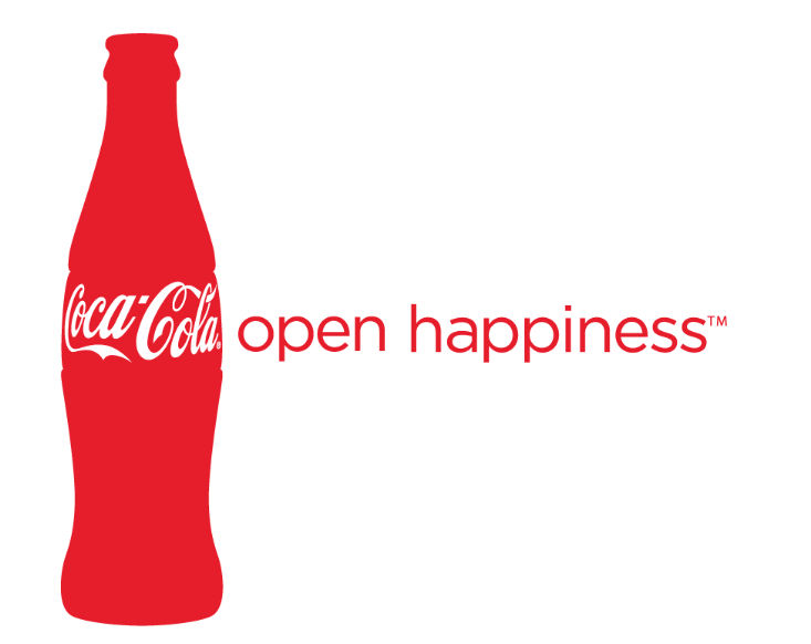
A sampling of Coca-Cola’s taglines and ad campaigns from the past 20 years include “Life Tastes Good” (2001), “Open Happiness” (2009), “Share a Coke” (2011), and “Taste the Feeling” (2016), all with strong messaging of sharing moments of joy, spreading positivity and creating connections.
Brand values
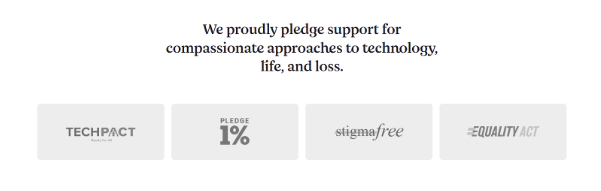
Brand values are the fundamental principles and beliefs that guide the brand’s actions and interactions with customers, stakeholders, and the broader community. Empathy, a platform to help people who have lost a loved one with all the technical and emotional aspects of the loss, is very clear on their brand mission – “to change the way the world deals with loss” – and their associated core values – being trustworthy, empowering, unconditional and caring.

Empathy’s values manifest in all their brand actions and interactions, from client-facing offerings to external organizations they support, defining a strong, consistent brand identity.
Brand experience
Brand experience is the overall perception and emotional connection that customers have with the brand based on their interactions, both online and offline. LEGO, for example, creates a consistent brand experience marked by creativity, imagination, and playfulness on every channel. Their digital platforms, like LEGO Ideas, encourage users to create, share, and be inspired.
Physical LEGO stores and events are typified by hands-on experiences in play and creative design.
The importance of brand identity
A strong brand identity is an intangible asset that contributes to a solid foundation for business success. Major benefits of investing in CI branding include:
Differentiation
In a crowded marketplace, a strong brand identity establishes a unique position and sets you apart from competitors.
Enhanced recognition and recall
Consistency in messaging and visual branding elements makes your brand both easily recognizable and easier to remember.
Audience connection
A strong brand identity helps you to attract, resonate with and create an emotional connection with your target audience.
Adaptability and expansion
A strong brand identity allows your brand to evolve and expand into new markets or product/service lines while maintaining its core identity, ensuring consistency even as your business grows.
An email signature is an integral part of a brand’s identity
Email signatures serve as an integral aspect of a brand’s identity, functioning not merely as a sign-off note but as a unique digital business card that encapsulates the essence of the brand.
A well-crafted email signature can effectively convey a brand’s personality, values, and professionalism. The signature design and content should remain consistent across the organization, reinforcing the brand at every point of communication.
Generate a company-wide email signature with WiseStamp

Outstanding brand identity examples
A solid brand identity is attained when all aspects of your brand expression – from visual elements to tone of voice to tangible experience – work together flawlessly to create one, unified expression of your brand.
Let’s take a look at several brands that have achieved excellence in their CI branding and analyze how exactly they orchestrate that unity.
Chobani
Chobani, best known for breaking Greek yogurt into the US market, underwent a successful rebrand in 2018. Rebrands can go bad, especially for known and loved companies, so it’s instructive to see how Chobani did it, and how they aligned every aspect of their brand expression with their brand identity.
First off, at the core of Chobani’s CI branding were their stand-out brand values:
- Natural
- Organic
- Down-to-earth
- Connected to people
- “Shepard-warrior” mentality: guarding the wellness of humanity
One of the most obvious changes was to Chobani’s typography:
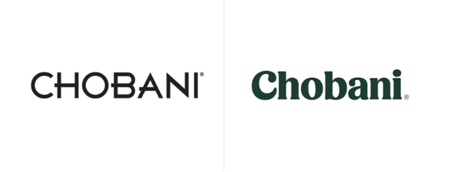
The old font was sans-serif, uppercase and angular, giving over a very modern, even distant, feel. The new font is serif, softer and gives distinct prominence to the lowercase letters, creating an inviting, informal and intimate feel.
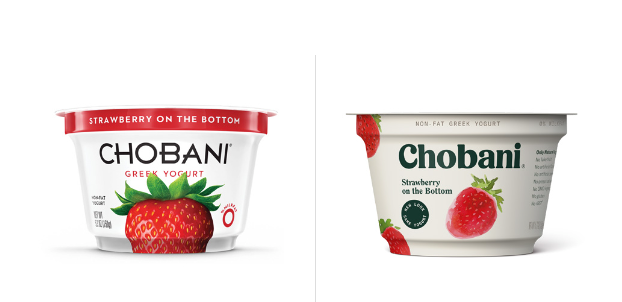
Moving on to their visual identity, the Chobani creative team focused on hand-drawn, “imperfect” images and a color palette focused around browns, off-whites and other colors recalling nature.
Chobani’s tone of voice is clear on their respect for nature. It’s telling that when Chobani expanded into oat milk, they promoted their new product by holding up real milk as worthy of admiration, not by denigrating it (a common theme among brands that produce plant-based milk products).
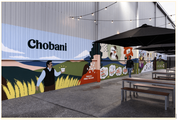
When Chobani built a new workplace in Melbourne, Australia, the very design was an expression of their corporate identity in its:
- locally and sustainably sourced rammed earth wall that serves as the “spine” of the entire complex
- incorporation of recycled timber in a majority of the tables and doors
- finishes and textures of the interior spaces that reflect natural elements and the down-to-earth nature of Chobani’s talent
- blurring the lines between staff and visitor spaces by intentionally linking them with a cafe in the middle
- outdoor collaboration spaces that facilitate incidental interactions, knowledge sharing and connection
- a laneway decorated by local graffiti artists who created pieces that reflected the Chobani vibe
Intel
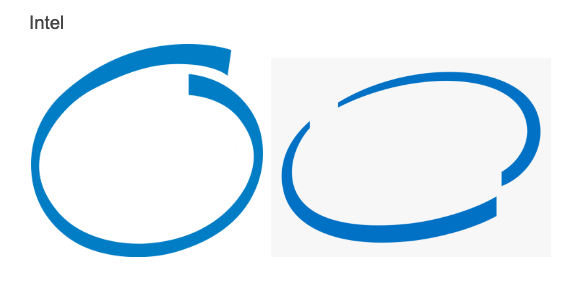
Recognize what brand goes… err.. “inside” these circles?
There’s no doubt about it. It’s Intel.
Founded in 1968, Intel’s brand identity was always about embracing innovation and ingenuity and powering progress through state-of-the-art technology.
In 1991, the Intel Inside campaign took their brand identity to the next level by communicating their CI branding in a way that the layperson could appreciate. The logo was simple and easy to understand: Intel is the power behind the throne of progress and innovation. The logo’s design featured two words in informal script inside an imperfect circle, conveying a “breezy straightforwardness,” a message directed toward the non-techie. The Intel Inside circle evolved, appropriately, as computing devices become commonplace and end-users grew more savvy and discerning, taking on a more classy and streamlined appearance in 2006.
Intel’s rebrand
Intel changed its visual brand in 2020, taking on a new look and feel while clearly remaining true to their brand history and identity. Their new logo is characterized by simplicity and balance, keeping some of the best design elements of past logos. And it keeps the blue that users have come to associate with Intel, while expanding the palette to blues in different hues.
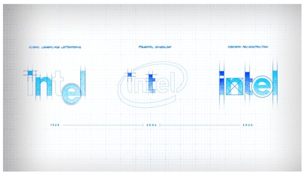
Instead of circles, the symbology focus in the new Intel visual identity is the square: the one that dots the “i.” This square, referred to as the “Spark”, symbolizes the power and potential Intel microprocessor. It is meant to convey the heart of Intel’s brand messaging: “all you need is an idea and Intel Inside to do something truly wonderful.”
Creating your powerful brand identity
Now that you’ve gotten inspired by some exceptional CI branding examples, how do you harness that power for your own brand?
The following is a comprehensive – although not exhaustive – list of practical steps to take in designing a brand identity:
Research
The first step is gaining a 360-degree picture of your organization, including:
- History and past legacy
- Values
- Mission
- Vision
- Culture
- Where you stand in the industry in regard to your competitors
- Historical and current target audience
You’ll also want to assess how your organization currently stands vis-a-vis a brand identity by evaluating existing:
- Visual materials
- Internal and external communications
- Other brand touchpoints
Get input from stakeholders on how they view the organization’s identity, including:
- Executives
- Employees
- Customers
- Partners
Input mechanisms may include:
- Workshops
- Interviews
- Surveys
- Mood boards
Ideas of questions to ask that can deliver valuable insights on how the stakeholder perceives the brand identity:
- Can you describe a memorable experience or interaction with our brand – either your own or an anecdote from a customer?
- If our brand were a person, how would you describe their personality and character?
- When you think of our brand, what particular emotions or words come to mind?
- Have you noticed any changes in the way people talk about our brand over time?
- What color and/or symbol do you feel represents our brand – and why?
Definition
Based on your review and analysis of all the above information you have gathered, develop or refine your definitions of your brand:
- Mission and vision
- Core values that guide your operations and decision-making
- Target audience
- A unique contribution to and position in your industry
Now decide how those definitions should play out when it comes to all the aspects of brand identity:
- Brand name
- Logo
- Color palette
- Typography
- Visual style
- Tone of voice
- Messaging
- How values play out
- Customer and employee experience (across all touchpoints)
You may discover that for some of those aspects, you’re right on the mark with how your brand expresses itself. Some aspects might need modification, and some might need a full makeover in order to be an accurate expression of your true brand identity.
Documentation
Unless you’re the only one doing anything that represents your brand, you’re going to need to concretize your above definitions in style and messaging guides that can be understood and applied by anyone connected to your brand.
If you’re looking to see what some of this process looks like in action, SME management solutions brand we wrote a candid article about the rebranding process that illustrates what it looks like to define your brand identity – and then how to practically bring it down into a range of visual branding elements.
The Power of a robust brand identity
Brand identity serves as the beating heart of any successful business, encapsulating its essence and expressing it in a clear and authentic voice. A strong brand identity goes beyond a logo or visual branding and design elements; it permeates every touchpoint and communication, from product design to marketing campaigns to physical spaces.
By understanding the power of brand identity and continuously nurturing it, companies can carve out a distinct space in the hearts and minds of consumers, standing the test of time and evolving in an ever-changing business landscape.