
Irresistible infographics that go viral: 9 fundamental tips
Learn how to create infographics with the fundamental principles doing successful infographics . Get infographic design tips and how to promote it on social media

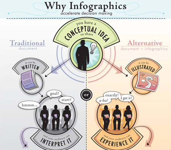
The question of how to do infographics has a combined solution that addresses both the informational and the visual aspects of this media type. The form your infographic takes and the way to prioritize and organize your information will determine how well your infographic story is laid out. It will determine if the story is clearly understood and if it piques the interest of your readers.
This is why our infographic tips will center on the fundamental principles of information visualization and information architecture rather than the practical creation process (don’t be frightened by the technical words, they spell out in simple and actionable tips).
This is a mildly advanced guide. Take a deep breath. Let’s go.
1. Sift through the data
Finding the right information is where it all begins. Whether you’re comparing two charts, taking raw data from an Excel sheet or PDF file, or sifting through a ton of information from multiple sources, you will only be able to go as far as your raw data will allow.
This is why you should make the effort to access solid information from trustworthy sources to support your story. Besides being credible, your data should be compelling and controversial to ensure that it will elicit a response from readers.
2. Define your purpose and audience
Once you’ve decided on a general topic and verified that the information you need exists, you can determine your purpose and audience. Do you aim to educate your audience? To lead readers to a specific action? To create brand awareness? Or to drive traffic to your site?
Knowing who you’re talking to, what they care about, and the kind of language they use is critical to defining the structure of your narrative and knowing how to communicate your call to action.
3. Find a compelling story
You might have access to all the data in the world, but if you can’t find a compelling and provocative story to tell, your infographic will most likely fail to engage your audience.
To ensure that you steer clear of a boring infographic, think of what your audience already knows about the topic so that you can add to their knowledge and even challenge their assumptions.
Concepts around which to center your infographic story:
- Enlighten them with new information
- Provide a solution or useful advice
- Appeal to their emotions
- Surprise them with an extraordinary finding
- Make them laugh
Infographics are unique in their ability to reveal trends and patterns hidden under the surface. Take advantage of this by framing your story in such a way that these revelations are not only crystal clear to the reader, but are uncovered piece by piece so as to build up to a climactic point—as any good story would.
4. Choose the visualization type that best suits your subject
There are basically 2 ways of visualizing data.
- Present the numbers as attractively as possible by artfully combining colors, fonts, graphs, and charts in an easy-to-understand and appealing structure.
- Use an overarching theme or metaphor to present the data in a compelling manner that is not explicitly numerical or in the format of a data visualization. The choice is up to you.
5. Choose the visual structure and hierarchy
In a study of more than 16,000 infographics, it was found that a majority of the most shared data visualizations were simple, brief, and easy to understand.
While we have become accustomed to thinking of infographics as dozens of graphs, charts, and stats put together on one page, their popularity on social media has led to their evolution into simpler formats, such as flow charts, single charts, and list-text infographics.
These are more popular than more complex data visualizations, such as timelines and infographics with mixed charts. Whichever format you choose, just make sure it is clear, accurate, and accessible.
You can organize your information in one of 5 ways:
- Alphabetically
- Geographically
- Hierarchically
- Chronologically
- Categorically
To ensure that your data dictates the structure of your graphic—and not the visual design—think about the information you have and how it can be represented in a way that aids comprehension and reveals patterns.
If readers have to make an extra effort to understand the data and what it means, then your infographic is not doing its job of making complex information simple.
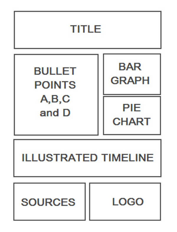
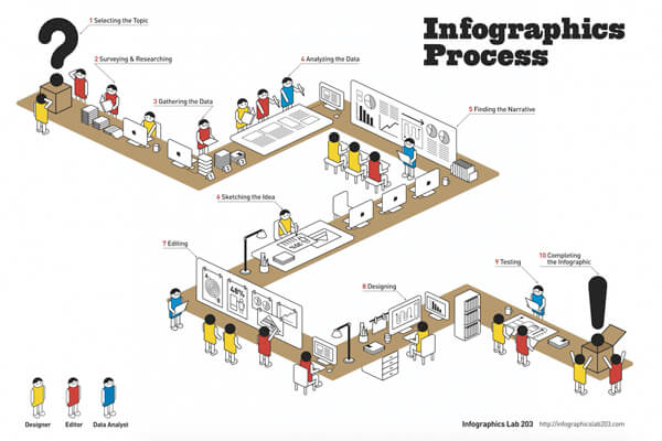
6. Build a wireframe based on your information organization
At this point, the designer should create a wireframe, which is a barebones mockup of what your infographic’s structure will look like. By stripping away the colors, fonts, and graphics, the designer can focus on the underlying structure and flow and make sure it will make sense to any reader.
7. Refine, test and proofread
Now comes the part where you evaluate your design–either with the client or in-house–and decide whether any changes need to be made. Once you have iterated until the design is clean and the infographic communicates a message clearly and effectively, you can proofread for any errors that might have gone unnoticed. This is critical since any error may be costly for both you and your client.
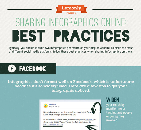
8. Determine a social sharing strategy
After putting in several hours of designing your own original infographic, you now have to make sure all the hard work doesn’t go to waste. Remember the step in which you defined the goals for your infographic? This is the part where you achieve those goals.
First, create a call to action at the beginning or at the end of your infographic. Next, make it shareable by including prominent share buttons on the page hosting the infographic and provide a code that viewers can use to embed the infographic on their pages and provide a link back to your site.
Then, create a drip campaign on Twitter, Facebook, Pinterest, and other social media platforms by sharing a specific fact from your infographic, one at a time. Also, remember the best time to share on each social platform.
On Twitter, for example, it has been statistically proven that tweets posted around 5 pm get the most retweets. In all, this process should take several days, even weeks, to complete.
10. Make your infographic
If you want to accelerate the infographic creation process, though, there are also free infographic creation software options available online, such as Visme, which can save time by providing professionally designed templates with a wide variety of styles and layouts.
Final thoughts
Infographics existed long before the Internet did, but it wasn’t until 2012 that they became insanely popular. Thanks to Twitter, Pinterest, Instagram, and other visual platforms, they’re one of the preferred content formats for digital marketers looking to hit a viral home run and get their name known—sometimes overnight.
Take, for example, the case of the design agency Infographic World. When Steve Jobs passed away in 2011, they spent a grueling 24 hours creating an awesome infographic that became an instant success.
The infographic not only received hundreds of thousands of shares and millions of page views but it was also featured on Mashable as the number one story for weeks. Traffic to their site became so overwhelming that their website developer warned their server was close to crashing.
In short, this is a party you want to get in on.